PERSONAL LOGO
In Foundations of Product Design we were asked to create a 3-dimensional logo incorporating our initials or relevant images using 3D printing, laser cutting, and/or wood working in order to familiarize ourselves with these techniques and the design process in general.
FINAL VERSION


INITIAL SKETCHES

My focus with my sketches was on my initials. I primarily worked with 'R', 'H', and 'Z', but also occasionally included the 'M' from my full name (Marion). I was also inspired by the ocean and wave shapes since that connects to the meaning of my name (mar means ocean in Spanish and rio means river). I used these sketches to think through the ways my initials overlap, how I could use color and depth, different fonts, and symbols. I also wanted to make sure my designs would take advantage of the 3D nature of the final model.

RAPID PROTOTYPES
Working from my initial sketches I went on to create a series of rapid prototypes to further explore possible designs. I began by working mostly with foam core.
My first prototype explored the idea of interlocking letters that could also be separated. I cut a channel in the 'R' so that the 'Z' could slide in and pinned the 'H' in place on top to hold the assembled letters together. My next prototype explored using different fonts and textures to distinguish between letters on a single object.
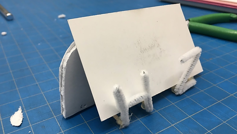
I used a foam core 'R' as my base and the dominant feature of this logo idea. I then added a cursive 'H' and 'Z' using a pipe cleaner. I liked that the R was still clearly distinguishable in this prototype and that the H and Z were connected, since my last name is hyphenated. I also found that I really liked the distinction that having a different texture for my first initial and my last initials created, even though it was not the original goal behind using the pipe cleaner (the original goal being to quickly achieve a smooth cursive font in 3D).
Another unexpected idea from this prototype was using the negative space of the 'R'. I had previously considered trying to use the negative spaces of my initials to create a logo, but when I wrote them in block text, I didn't like the results. However, when I looked at the more curved negative space of the loopy 'R' I used for my previous prototype, I liked the shape a lot, especially since it reminded me of waves.
Working with the idea of using the negative space of the 'R' I had the idea of creating a business card holder using the 'H' and 'Z' of my initials to support the front of the card.
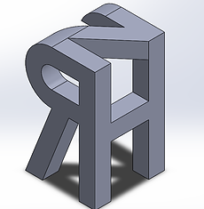
When I moved to the wood shop I was planning on doing a higher resolution version of my first foam core prototype. However, after I created a wooden 'R' I was reminded of a sketch of a "name cube" I did for an assignment in Design Sketching the previous year, and decided to create a physical prototype of it. The 'R' was made intentionally backwards to keep it on the "front" face of the cube, while simultaneously lining up the edges of the letters. (I later realized the 'Z' was backwards in my prototype). I liked that this logo design made use of the 3-dimensional aspect of the project.


DIGITAL PROTOTYPES AND FABRICATION
For my digital prototypes I decided to continue with my two favorite ideas: the initial cube and the card holder.
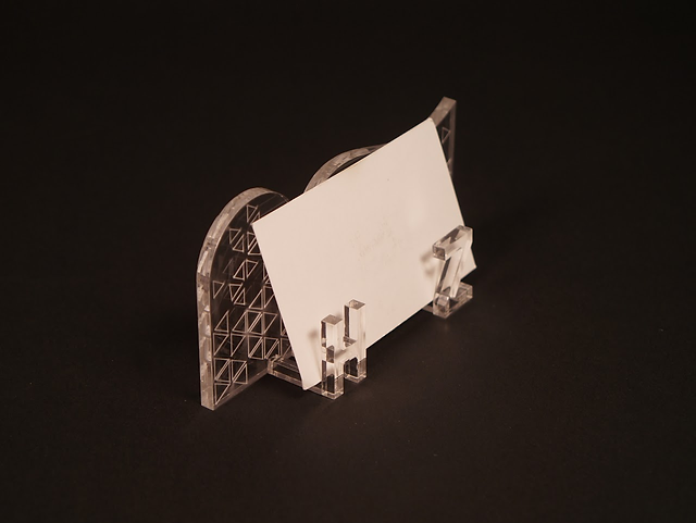
For the card holder I used Adobe Illustrator to create 2D files in order to cut my business card holder on the laser cutter. I created these files by exporting the different faces to DFX from the SolidWorks model I had already created, which is a technique that has come in handy a lot since this project.
I decided to 3D print my initial cube using an Ultimaker3. I ultimately decided that this design looked like anyone with the same initials could have made it. Although I made choices about which letter to put on each face, what font to use, the dimensions and proportions, and to round of the 'Z' to match the 'R,' this logo didn't feel very personal. So, I decided to pursue the card holder instead for my final design. I also liked the idea of the card holder since it has a practical purpose and laser cutting has more options for material and involves the creator more in the assembly.
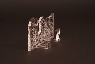
To improve on my initial model of the card holder I made two major changes. First I changed how I attached the pieces together. I removed slots in the back piece which initially held the stems for the letters. The slots caused the acrylic cement to spread onto the back, creating unattractive marks. Instead I applied a small amount of acrylic cement to each stem and applied it directly to the front surface. The second change I made, was inspired by the marks on the back of my first prototype made by excess acrylic cement. I thought it would add some character and dimension to engrave a pattern on the back piece. I chose a geometric pattern based on equilateral triangles, because I connect the shape with engineering.
REFLECTIONS
Through working on this project I became more comfortable working with the tools in the Product Realization Lab, especially the laser cutter, 3D printer, band saw, and wood hand tools (rasps, files, etc.). I also became more familiar with the design process in general and how prototypes can be used to test a specific idea, and prompt new ones.
Some lessons I want to remember for the future:
Thank you to my coaching group, the ME102 teaching team, and my classmates for your feedback, support, fresh ideas, and inspiration.
-
Starting with more ideas leads to a better end product
-
Prototypes are good for thinking through ideas and generating new ones
-
Things always take more time than expected, but it is usually worth it in the end
-
Ask for feedback and advice when you're feeling stuck